Go back home
Q2 2023
Q2 2023
Website Redesign for Luxury Fashion 🛍️
Website Redesign for Luxury Fashion 🛍️
Website Redesign for Luxury Fashion 🛍️
⚠️ Hi there! This is a minimised version of this case study. Please, grab a bigger screen for full the experience.
Product vision: Etailer is a fashion concierge service, catering to a clientele seeking high-end fashion yet facing challenges navigating international e-commerce platforms like Farfetch from Africa.
Contributions: I spearheaded the design process from start to finish, crafting a platform that not only appealed to our target audience but also offered a smooth and intuitive user experience. I designed the website's interface, categorising products for men, women, and children. Additionally, I designed a dashboard for both vendors and Etailer admin, enabling them to efficiently manage product uploads, customer communications, sales analytics, and other essential tasks.


Role
Role
Role
Product Designer
Product Designer
Product Designer
Industry
Ecommerce
Ecommerce
Ecommerce
Industry
Industry
Industry
Finance
Finance
Finance
Team
Team
Team
Dami/Product Designer
Dami/Product Designer
Dami/Product Designer

Kess/Product Owner
Kess/Product Owner
Kess/Product Owner
🙁 Challenge
🙁 Challenge
🙁 Challenge
Etailer faced a significant challenge in effectively capturing and converting its target audience of high-end fashion consumers in Nigeria. Despite providing exceptional fashion concierge and personal shopping services, their website was not resonating with their clientele.
😊 Results
😊 Results
😊 Results
We successfully increased brand trust, attracted new customers, and boosted online sales with the redesign. The improved user interface, enhanced product visibility, and brand identity contributed to a more positive customer experience, leading to increased customer satisfaction and loyalty. This proved to be a strategic success in establishing as a leading platform for luxury fashion.


Problem discovery
Problem discovery
Problem Category / User Flow, Design, Responsiveness
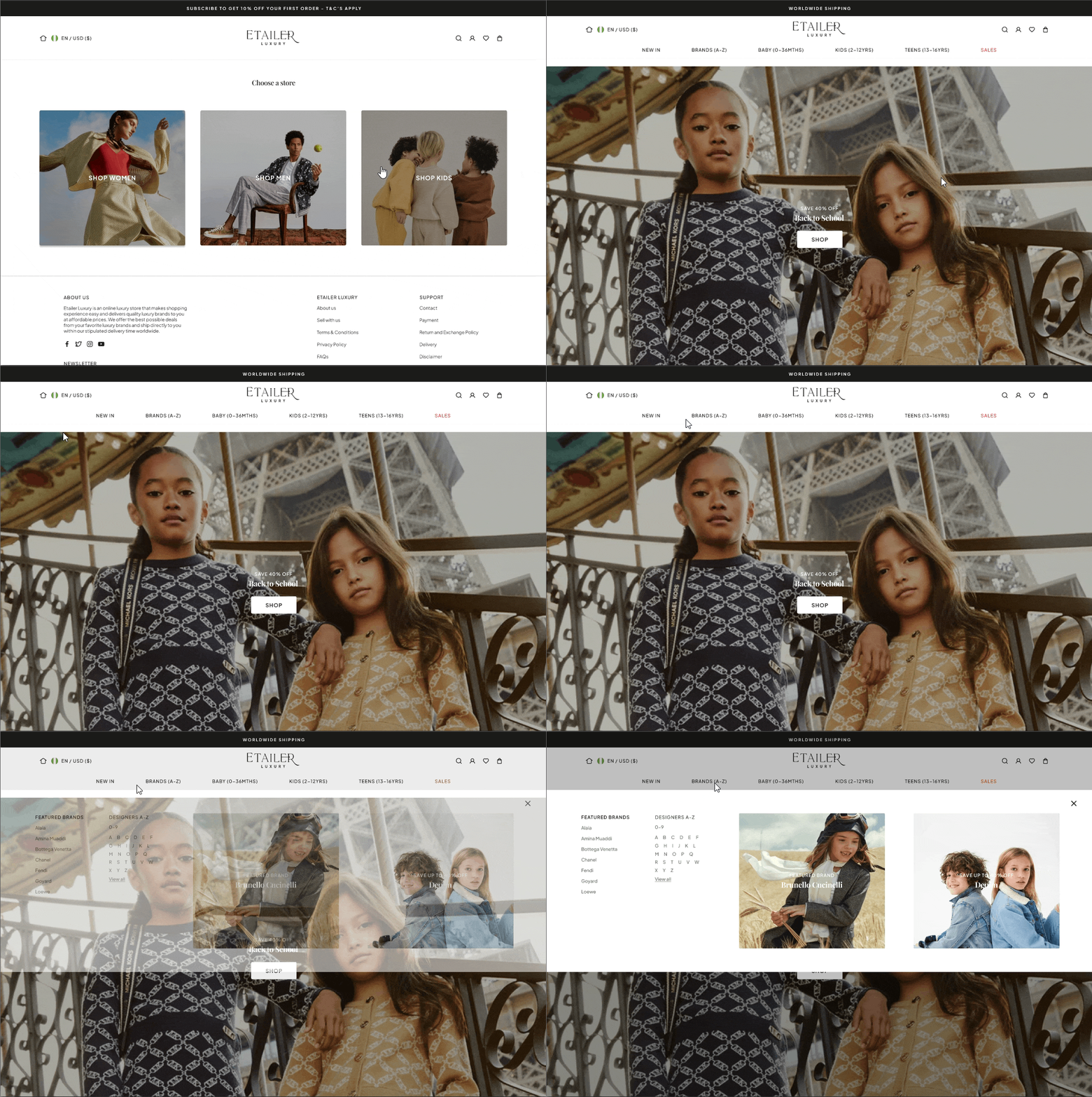
One of the first things I did here was an audit of the existing website to identify key areas for improvement. Some of the things I notice were, The inconsistent visual language - elements were disjointed and lacked of cohesion. The website design was outdated and did not align with the luxury e-commerce trends.
Additionally, the website's responsiveness was poor, particularly on mobile devices, with the layout not adapting well to different screen sizes resulting in poor readability. The navigation structure was complex and confusing, making it challenging for users to find what they were looking for. The website also lacked clear and compelling calls-to-action, hindering users' ability to take desired actions. Finally, slow load times, especially on mobile devices, further contributed to a negative user experience.
To further develop this idea and identify the problem, I started reading, researching, and talking people in the industry to figure out current trends, gaps in the fintech app market, to understand user needs and market potential.
The process
The process
Unlike some of my projects, the design process was pretty linear. Because I was new to designing for the finance market, It was important to religiously rely on competitor analysis using usability guidelines, user interviews and testing, and analysing insights from my findings.
I also worked on a concept generation process - Who, What, Why?, I moved on to brainstorming user flows and information architecture of the app. I made a combined flow so that I could asses the app and its functionality as a whole. This helped me work out what features to include and how they would be connected.
The Solution
The Solution
A simple, straightforward app with basic functions such as transactions - users can manually enter transactions, categorise them, and have them reflected in their budgets; budgets - users can create budgets and allocate funds to different categories (rent, food, transportation, etc.); and notifications when they exceed their budgets. Finally, goals let people set money aside for their wants and needs.
These elements were key for the MVP of the app. It would be lovely to explore other unique features like bank account syncing so users can have their transactions updated as soon as they spend, reciepts uploading feature, using AI to read and add to user's transactions, group goals so users can save towards objectives with their friends, and many more.
some Concepts
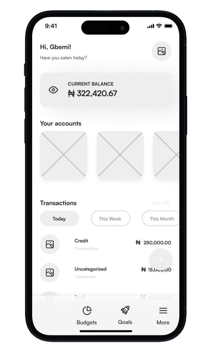
Home page
This was a direct interpretation of the wireframes. I was able to identify usability issues with this after testing
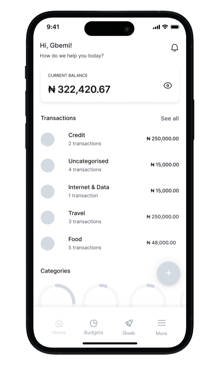
Refined version
This came after a refining user insights and basic usability rules. I refined the layout, prioritised the transaction categories
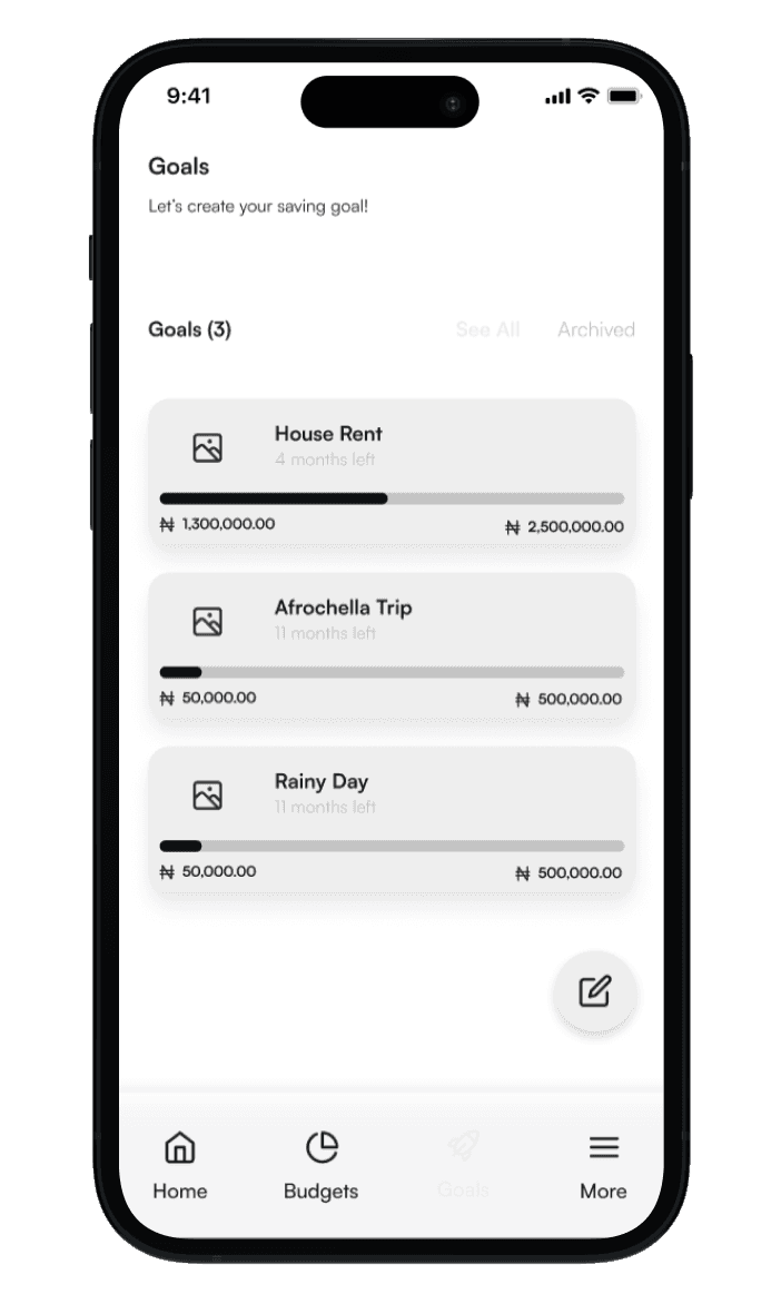
Goals
This version of goals was impossible to understand, which defeats the purpose of a user friendly app
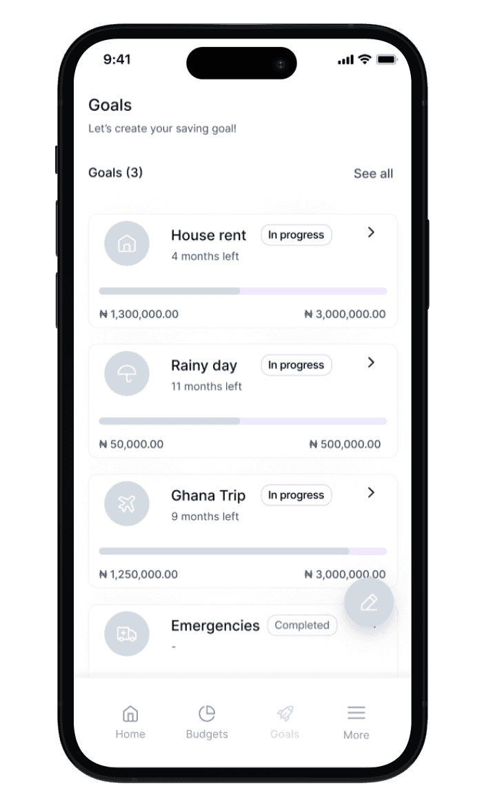
Refined Version
Here I utilised white space within the cards and also introduced badges so users are able to identify goals without having to click on the goal

Final* prototype
There is often never a final version, is there? 😂 This concept took us closer to what we intended to achieve with the MVP & a better defined design system
"Dami is an excellent storyteller, She took everyone on a journey. At the end of her presentation, we were all drawn to the practical solution she proposed. She will go places and do more meaningful work."
"Dami is an excellent storyteller, She took everyone on a journey. At the end of her presentation, we were all drawn to the practical solution she proposed. She will go places and do more meaningful work."
Judge
Microsoft hackathon
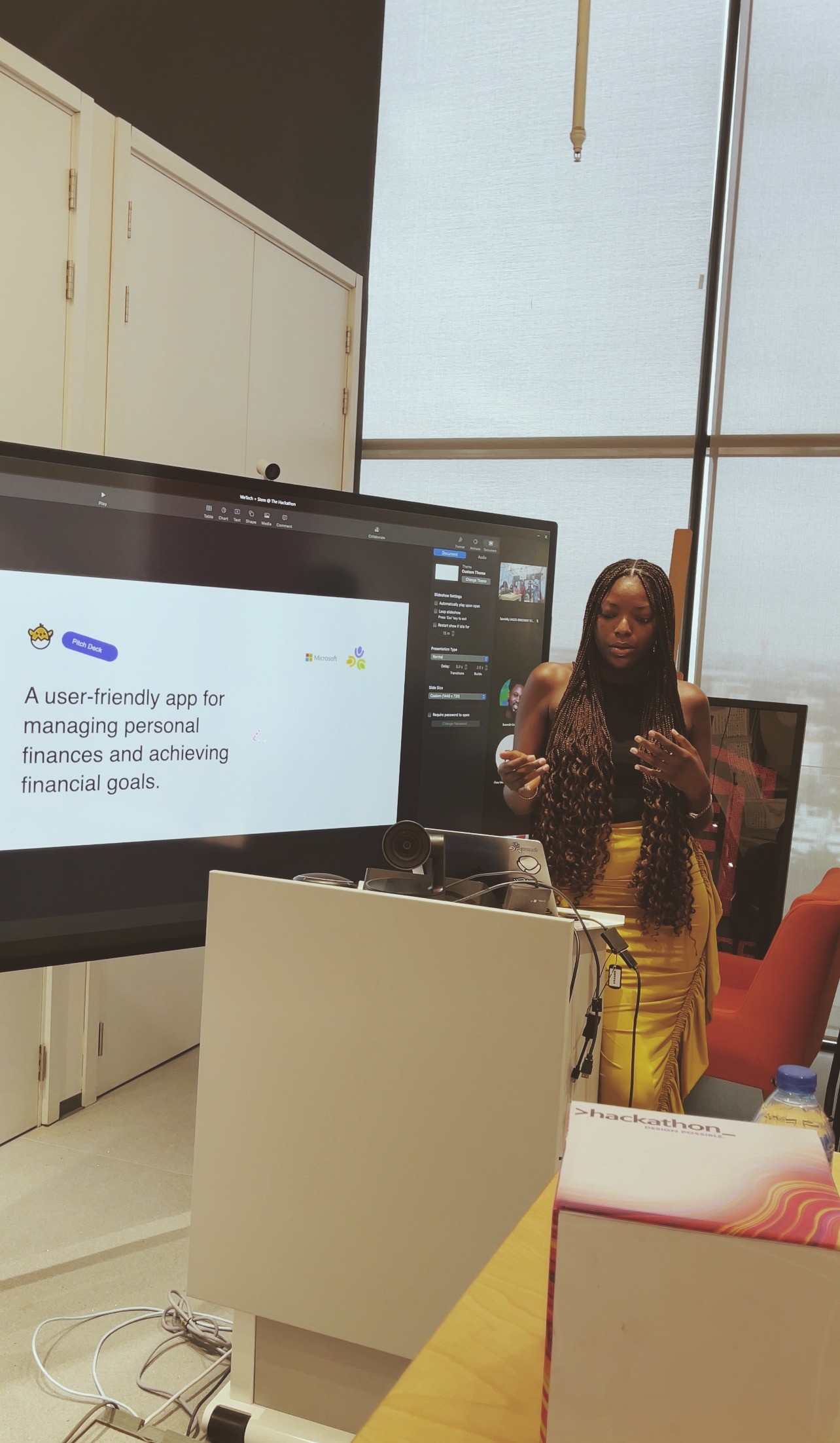
The pitch
Till date, this was a milestone in my career, pitching an idea I had as a UX newbie in front of an audience and judges (in-person and virtual) and getting phenomenal feedback was incredible!